
2024 at Rubrik
Aura Visual Enhancement
Duration: 4 weeks
ROLE: visual designer
TEAM: design system team
Aura is Rubrik’s internal design system website. This project focused on redesigning the hero sections across all component documentation pages to create a more informative and visually cohesive experience for users navigating the system.
I explored and refined visual and motion design solutions through 4+ iterations, guided by Binan (senior designer and mentor) and Reuven (principal designer).
Design Goal
Redesign the hero sections of 24 component pages to
Improve visual hierarchy and clarity for faster user understanding.
Support scalability and ease of maintenance across the system.
Reinforce Aura’s visual language and consistency.
Brfore

After

Illustration Exploration
In early explorations, I reimagined the component card as a dynamic illustration that adapted its background shape based on each component.
✅ Emphasized content and added visual storytelling.
❌ Difficult to scale and maintain due to high dev effort and manual updates.

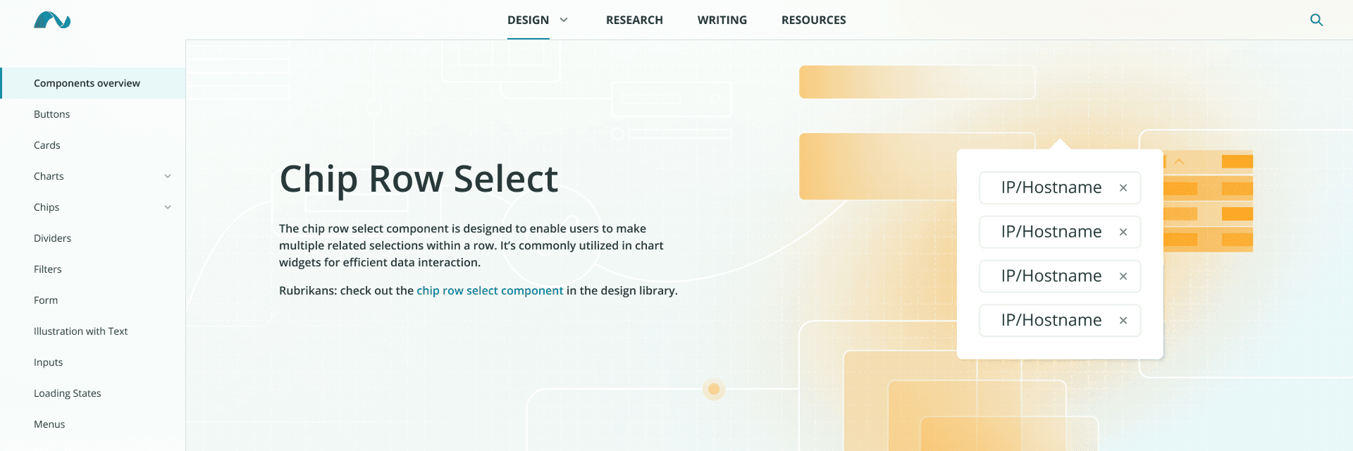
Master Design
Component card


Version 1 hero section design


Version 2 hero section design


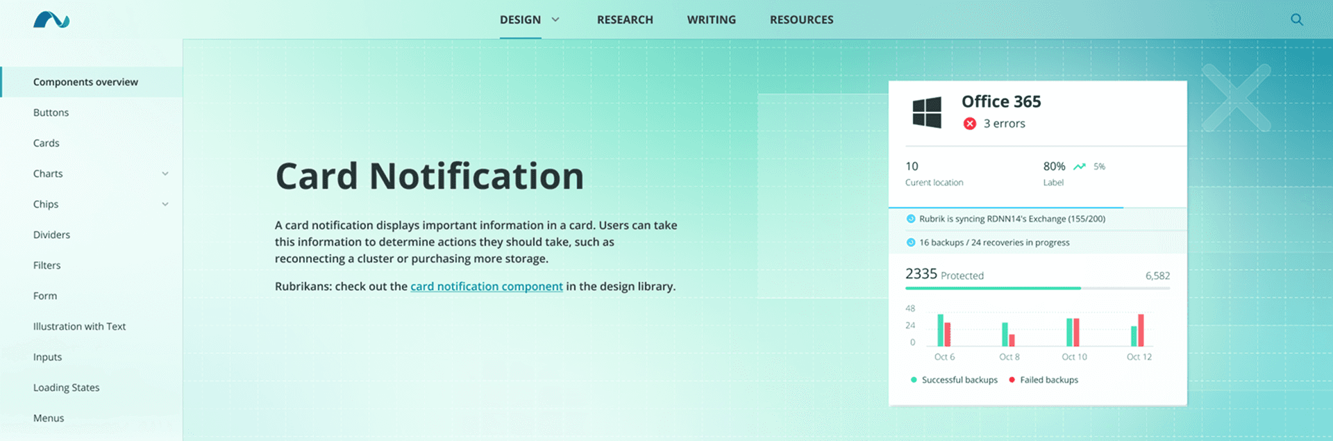
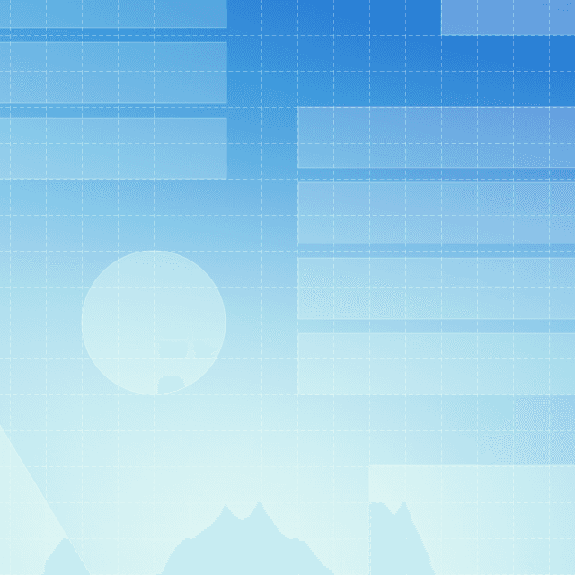
Color Exploration
In later explorations, I simplified the visuals into a unified scrolling background—using gradients and brand colors to differentiate component pages.
✅ High contrast and saturated gradients improved visual appeal, with better scalability and easier maintenance.
❌ Using different colors across 20+ pages risked tonal inconsistency, even within the brand palette.
Master Design
Gradient Guideline


Version 3 hero section design


Version 4 hero section design


Motion Exploration
I explored motion in the background visuals to make them more dynamic without distracting the user.
Linear Loop
Zoom-in and zoom-out
Opposing
Ease-in and ease-out
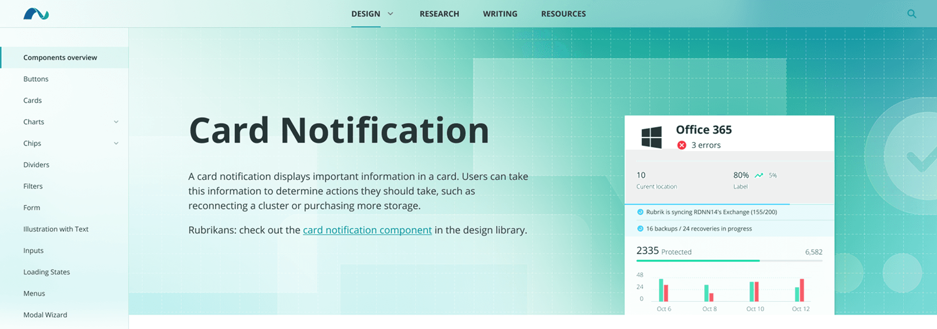
Final Deliverable
The updated (in-progress) version introduces 4 key improvements
Increased font size for better readability
Added component examples to provide context
Aligned color styling with the brand’s tone
Introduced subtle motion for visual engagement
Take Away
For the latest final delivery version, we removed the illustration and focused the visuals on the key branding color gradient. Throughout the design process, I learned that maintaining a balance between creativity and consistency is key to sustainable design. I am truly grateful for the team's support throughout the process, providing me with insightful guidance and valuable learning experiences.